Monday, 12 December 2011
Page Spreads
Sunday, 11 December 2011
Non Alcholic Cocktail Mixes
Non Alcholic cocktail mixers I'll be using to inspire the ideas for the Beautiful Blends Cocktail Calendar.
Saturday, 10 December 2011
5 Golden Rules
Change of Images throughout Season
Calendar Examples
A calendar is also a physical device (often paper). This is the most common usage of the word. Other similar types of calendars can include computerized systems, which can be set to remind the user of upcoming events and appointments.
A calendar can also mean a list of planned events, such as a court calendar.
The English word calendar is derived from the Latin word kalendae, which was the Latin name of the first day of every month.
Wednesday, 7 December 2011
Coca Cola - Girls | CC Research
Ways of Promoting the Brand - Possible Pro' Range
Calendars for work and home environments would keep the brand in the viewers head all year around. Could include illustration work or drink ideas to suit that particular month.
Serving trays for bars and clubs could be used as a way of placing the brand around a bar for the night life side of the drink?
Coasters to match design of tray?
Poster promotion with a clear and simple message. "Dump the Lumps" taken from Feel Good webpage is strong but I don't want to market a healthy drink along side the word, dump.
Cardboard cutouts for the edge of bars and pubs.
Drinks Carrier for sharing?
Monday, 5 December 2011
Ideas on the 750ml Bottle
More relevantly seen with the coca cola advertising strategy. Sharing the product is seen as an exciting way of socialising with friends that is marketed in such a way that it is seen to be enjoyable all year round, at any occasion.
The main focus that Feel Good are driving is the healthy side of drinks. As a premium drink however is something that's commendable or expected by the user.
J20 Metter to Bix
Clever way of advertising that doesnt directly reflect their product but instread creates a talking point based around the adverts.
Shloer Sprakle Advertising
The ‘It’s your Sparkle’ campaign, created by Bray Leino, aims to broaden the appeal of the brand, encouraging women to embrace the idea of ‘sparkling sociability’ and having fun with your favourite people – the key messaging behind all Shloer’s activity in 2006.
Shloer is launching a new television and print ad campaign as part of a £10 million brand investment.
Making its television debut on 16 May, during the second series of ‘Lost’ on Channel 4, the advert will run throughout the summer until 30 August and again in the run-up to Christmas.
Running 800 times on ITV1, Channel 4, Channel 5 and a number of satellite channels, each 10 or 30-second slot has been specifically chosen to maximise Shloer’s exposure to the target age demographic – 25 to 35-year-old women.
The ad is set within a night-time house-party scenario – with three girlfriends having a great time, enjoying Shloer and sharing it with the rest of the guests. The commercial builds up to a big finish as the girls and the rest of the guests, with Shloer acting as the catalyst, dance the night away to a stunning reworking of Cole Porter’s ‘I Get a Kick Out of You’.
Full of ‘sparkling’ moments throughout, the ad ends with a spectacular firework and synchronised swimming finale.
Filmed on location in Palma, Majorca, and directed by Michael Gracey – praised for his inspirational adverts for Marks & Spencer and the creative genius behind videos for Will Young, Charlotte Church and The Sugababes – the advert uses a cast of more than 80 dancers from as far a field as Australia, Spain, Italy and England.
They perform an inspiring dance routine, choreographed by Ashley Wallen, lead choreographer on the movie blockbuster ‘Moulin Rouge’.
‘It’s Your Sparkle’ continues as a theme across nationwide print media to coincide with the timings of the television advert, and will cover a wide range of women’s consumer and trade titles such as Glamour, Cosmopolitan, Company and The Grocer.
The total brand investment for 2006 includes a complete re-packaging of the entire Shloer product portfolio and a PR campaign run by Bray Leino Public Relations.
Mike Coppard, managing director of Shloer, says: “With such a significant financial investment in the brand, this year has already been extremely big for Shloer and it will get even bigger once the advert goes live. We have created a campaign that fits perfectly with Shloer’s products and the target audience, and one which is set to lodge firmly in people’s minds.”
Art director for the advert, Dean Sampson of Bray Leino, says: “This is a great campaign to be involved with and we are extremely proud of it. We embraced the brief from Shloer and really made it sparkle – and both the TV and print ads reflect this.”
Approach
The area itself is one of Feel Goods largest sectors and in promoting this, this will hopefully create enough interest and a talking point that will transpire across the whole brand and it's other products.
The challenge of the breif then becomes a little simplified than the current brief. What I'll be aiming to achieve is to find ways of promoting the brand with a clear focus on the possibilities of sparkling jucie drinks within and outside of the home.
Escially for within the home I don't think marketing the brand as an alcholic mixer will do the feel good image any favours so possibly focusing on non alcoholic mixers or maybe even two methods of prmotion, one for the home owner and one for the bars and pubs?
What needs to be clear is the premium side of the drink with a stong reinforcement of the healthy option. Why is this brand better, why am I paying more than other drinks? This is something that I'll be constantly coming back to in finding clearer ways of promoting.
Feel Good
Within this field Feel Good has two main competitors, Shloer and J20. J20 is a product that is concentrated on the sparkling juice industry and is largely successful within bars and pubs. This is a market that Feel Good is trying to tap into and effectively replace with the angle that they're a much healthier brand in terms of sugar content and quality materials (as mentioned on FG' blog).
The issue that Feel Good are having is that they feel that their marketting is failing them in recieving the awareness that these other brands have. From my expierence working for a well known super market chain in home delivery, the sparkling juice drinks in general are a very low selling product in comparison to your average carbonated drinks such as Coca Cola or Sweppes. The problem is addressing that main issue in terms of the consumer. Is this area of premium drinks a product that can be enjoyed whilst socialising rather than one that can be enjoyed at home?
What I need to address is the current targetted audience and cross reference this with some of my own market research to see if what the company wants to achieve is being achieved. This could be carried out through questionnaires and surveys. Obviously I'm aware my time scales so this will need to be a quick turnaround.
Sunday, 4 December 2011
Thursday, 1 December 2011
Channel Rebrand
Come across these guys before, always excellent work. Inspiring ideas of their channel rebrand.
http://www.arsthanea.com/nfilmhd-tv-channel-rebrand/
Wednesday, 23 November 2011
Case Designs / Packaging Research
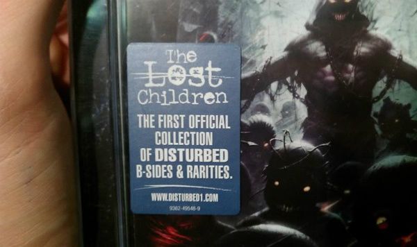
I've ordered the photographs into a simple to complicated system. The covers that are appealing to me the most are the larger, more compelx designs. The problem with this is that we're currently designing for one CD so finding a reason to spread the case over this size may be difficult. However I will need a section to hold my insert containing the lyrics and band biography. Pictures binded below;
Rear Cases/Labels/SE Cases
Main Points of Interest for further development:
Cut out sections I'm wanting to include
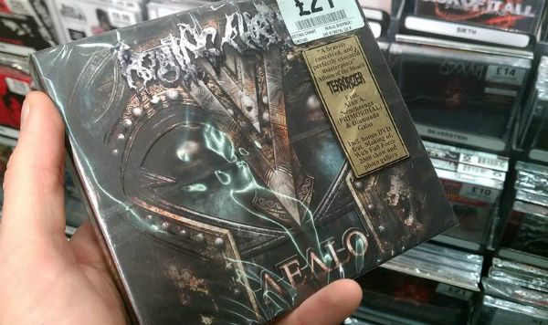
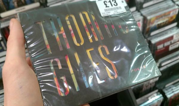
Labels
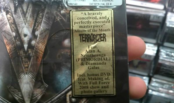
Possible copy - Includes new track Nightmare plus bonus DVD
Leeds Art Gallery - Backdrops
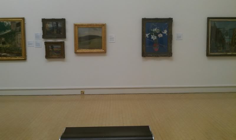
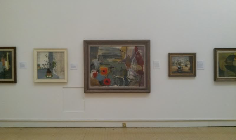
Just want to talk a little about the image above. I really found this wall appealing in terms of it's layout. I want my main image to be the focus but I still want it work with the gallery style by including other pictures. The layout of having the main image in a large frame and too smaller ones appears to work really well. If I applied this to my design work I should be able to get a clearer hierarchy in focus points.
Images from various places on the net:


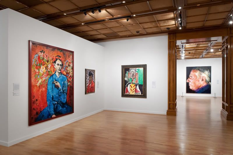

Leeds Art Gallery - Frames
Wednesday, 16 November 2011
Dmax Web Breakdown
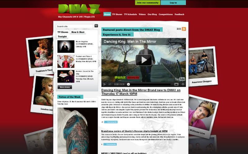
So the site itself is pretty boring. We've got the terrible 3d logo up top. I mean, if we had to just talk about the logo itself I think we'd be here for quite some time. The composition of the whole logo as a whole is just bizare. The rotation of the D is kind of explainable'. I mean, I can see the idea of maybe wanting to seperate the D and using the word MAX but this didn't happen. We've got D...MA and the X? Why is the X pushed so much forward on Z axis. Is to say "Hey you! yeh look over here, I'm 3D'. What was the thinking behind this, I'll never know but for me it just doesnt work.
The colour scheme red and green is a little bit ready steady cook or even just a bit festive for my liking. And the polaroids running down the sides don't reflect anything about the programming and it just feels a little 90's photoshop in how their framed.
Tuesday, 15 November 2011
Cinema 4D Tutorials
Sketch&Tooned Particles from Chicago C4D on Vimeo.
How To Create a Glowing Text Effects in Cinema 4D from Nick Campbell on Vimeo.
How To Make Bubbly Rounded Type In Cinema 4D from Nick Campbell on Vimeo.
How to Use The New Depth Of Field In Cinema 4D R13 from Nick Campbell on Vimeo.
Cinema 4D Deformers: Bulge Deformer from Nick Campbell on Vimeo.
Cinema 4D Texture Tips and Tricks from Nick Campbell on Vimeo.
How To Use Dynamics, Particle Emitters, and Different Camera Angles in Cinema 4D from Nick Campbell on Vimeo.
Texture Kit Training: Texture Rig from Nick Campbell on Vimeo.
Ribbon Wall Graphic Animation in Cinema 4D from Nick Campbell on Vimeo.
Tutorial Preview: Animating Dynamics from Nick Campbell on Vimeo.
OFFF Year Zero: Nick Campbell from Nick Campbell on Vimeo.
How To Use Global Illumination to Light in Cinema 4DHow To Use Global Illumination For Realistic Light in Cinema 4D from Nick Campbell on Vimeo.
How To Make The Cherry 7up Look With Cinema 4D from Nick Campbell on Vimeo.
Vimeo Festival + Awards -- Nick Campbell from Nick Campbell on Vimeo.
Reflective and Refractive Glass Block Tutorial Part 1 - Cinema 4D from Nick Campbell on Vimeo.
How to make a Simple Spin Logo Animation Part 1 from Nick Campbell on Vimeo.
AE Tutorial's
Galaxy Orbs
Light Glows
Shatterize
Glass particle
Particle Explosions
The Ring
Rotation
3D Shadows
Speed Partilces
Colour Universe
Title Plate
Audio As Animation
Stroke FX
Light Particles and Blurs
Artist's From the Shows
I figured this could be a nice idea for an intro to all five shows so below is all the info I'll need to know on the featured artists of each show.
Corey Miller
The Shop Info
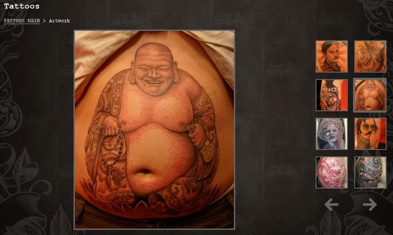
Six Feet Under is located 45 minutes from Hollywood in historic downtown Upland, California. The shop opened it's doors on April Fools Day in 1997 and it was clearly no joke, as the shop is still going strong 11 years later.
The shop has the feel of an old school tattoo parlor and the look of a modern gallery. Six Feet Under built its foundation on a strictly underground basis and did not seek out the spot light or to be one of the most visible shops in the tattoo world. With no flashy storefront and no advertisements for the shop, word of mouth was the only thing needed to keep the business thriving.
Over the years the shop has tattooed everyone from the average Joe to some of the biggest superstars in the world.
"It's been an amazing ride. I remember the opening party and now, 11 years later we are going stronger than ever. We have truly come full circle." Corey Miller.
http://www.sixfeetunder.com/tattoos.asp
KAT VON D
Kat's Biography- As told by one who knows her.
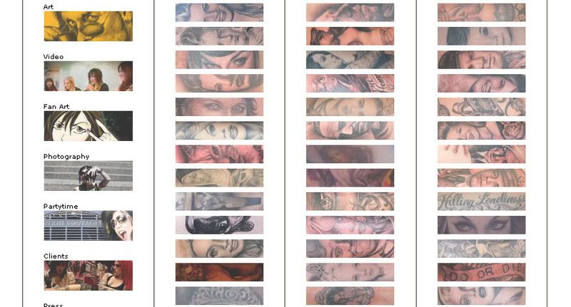
It's a funny thing about biography pages on websites... they never seem to achieve their goals. Ostensibly, the facts presented seem to attempt to give you some idea of the artist, where they are from, where they are going, what they believe to be valuable, etc... they are intended to let the visitor know better the person behind the work, but usually fall far short of communicating any real sense of their character. They read more like a bland political pamphlet than an insight into their personality, and in doing so, nothing more than a contrived sense of image is conveyed. It is with this in mind and in the spirit of trying to do better that, when asked, I gladly accepted the chance to write this little note and hopefully help those who are curious to know more about my friend Katherine.
I guess it makes sense to start with the basics. Born on March 8th, 1982, in the town of Nuevo Leon, Mexico, she moved to the States when she was four, settling in Colton, Ca. Her father René Drachenberg and her mother Sylvia Galeano were both born in Argentina, though René's family origins were German and Sylvia's Spanish-Italian. Kat's paternal grandmother played a significant role in shaping her artistic development, particularly in playing piano and exposing her to the great composers, which, as anyone who knows her can attest to, led to her love for the works of Beethoven . Kat maintains a strong relationship with her parents and her siblings, a brother Michael and a sister Karoline, and finding the time to spend with her family is a priority.. Growing up in the Inland Empire, a collision of influences led Kat into our world much earlier than most, her first tattoo came at age 14, an old english "J" on her ankle, a memento of a love gone-by. Shortly thereafter, realizing her natural art ability, in early 1996 her friends asked her to pick up the machine and get to work on them (her first effort was a Misfits skull with a homemade rig), the tattooing wasn't easy but she knew it felt right and she knew she wanted to pursue it. In 1998, she began working in her first professional shop, Sin City Tattoo, a local place in her neighborhood. A year and a half later, she moved on to Blue Bird Tattoo in Pasadena for a year then on to Red Hot Tattoo in Arcadia. A little under two years later she started working with the talented bunch at Inflictions, a shop out in Covina, Ca.. This was a great period of growth in her work and led to her eventually moving down to True Tattoo, a chance to work with Clay Decker and Chris Garver. Any tattooist worth their salt can see what an honor and an opportunity this was, and any one who had known Kat over the course of her career to that point knew that not only did she deserve the chance but was sincere and talented enough to add to the already high standards of that shop. In addition, it afforded her the opportunity to live and work in Hollywood, the heart of the city that she loves, Los Angeles. With this group together and the quality of the visiting artists and the additions to the line-up over the years, True Tattoo has become one of the shops that any real enthusiast (whether artist or client) must visit, a place where something great is always happening.
So much for the basics of her biography, let's move on to the what I think really matters, who I feel she is as a person and who she is as my friend. From the moment we met, I knew she was a bright, talented girl with a true affinity for tattooing and our six years of friendship have offered me a view of her life that not only confirmed my initial impressions but exceeded my expectations. As many of you who have tried to arrange an appointment with her know, she's booked completely with a long waiting list, but what most people aren't aware of is that long before she appeared on television, she was one of the busiest artist's in Los Angeles. Her work spoke for itself and each piece she finished brought in fresh interest, this in addition to her comfortable bedside manor had her working at a pace that few equaled. To this day, I'm regularly astonished at her work ethic and enthusiasm for every piece she does, and her endurance, I say with lack of any exaggeration, is extraordinary. She is generous to a fault, incredibly loyal to her family, friends, and those in our business who treat her fairly; and despite all the bullshit that is part and parcel of this industry and the demands she is under, she is generally in a good mood and always finds the time to be there for you if you need her. I am glad to know her and proud to call her my friend.
with all sincerity,
I am,
Kore Flatmo
August 15, 2006
http://www.katvond.net/tattoos.php
Louis Malloy
Our Work Speaks For Itself
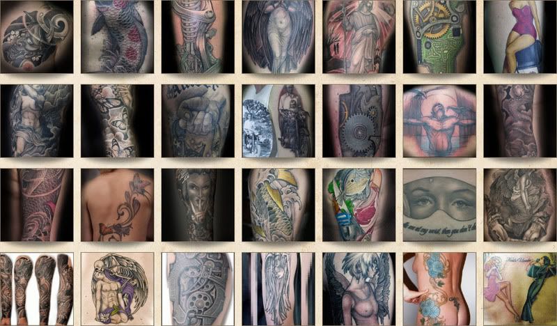
Resident artist Louis Molloy has been a professional tattoo artist for 24 years and has been at the Middleton Tattoo Studio for that length of time. Louis has also done many guest spots in studios in both Europe and the USA. He is a very versatile tattoo artist as our galleries show and can work in any style.
Awards
Louis Molloy has won many many awards down the years but feels the only ones truly worth mentioning are the two awards for outstanding artist of the year UK in 1986 and 1993.
The tattooing of many celebrities has given the studio a very high profile in the media but it must be stressed that all clients are equal at the Middleton Tattoo studio.
http://tattoos.co.uk/galleries/studio/
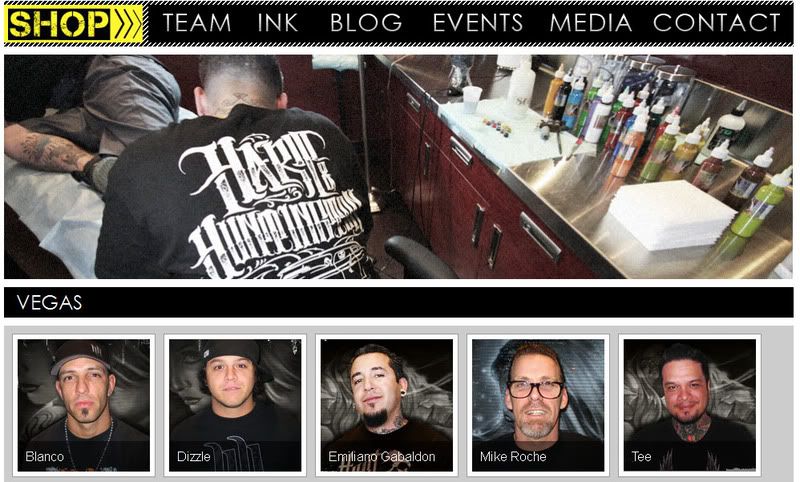
Carey Heart
Known for his extreme motocross moves, Carey Hart is one of the most recognized names in the motocross world and in the world of sports in general. Carey began competing in the sport in 1981 and by 1999 had garnered global attention by winning the Gold at the Australian X Games and the silver medal in the 2002 US X Games. Acknowledged as the inventor of the "Hart Attack," a show-stopping maneuver performed on a 250cc motorcycle, and celebrated for his impressive back flips, Carey catapulted the sport to an entirely new level and continues to be an influence to this day.
In 2004, he turned his passion for tattoos into a serious business venture and partnered with John Huntington to create the Hart & Huntington Tattoo Co. (H&H). Located in the prestigious Palms Casino Resort in Las Vegas, H&H caters to a mix of rock stars, celebrity VIPs, locals and tourists who clamor for the shop's original and irreverent tattoos.
Carey hasn't stopped there. He has taken the H&H brand to another level by introducing the H&H clothing line in retailers Nationwide. The line includes a hip assortment of shirts with original H&H designs and features accessories such as belts, hats, wallets, wrist bands, messenger bags and purses – all in keeping with Carey's own tastes and sensibilities. The line has two collections: an upscale version sold at fine department stores and a standard line available at mid-tier and numerous specialty stores.
There is no denying Carey's dedication and passion for everything he does. He has suffered his share of physical injuries during his motocross days but, through all of the pain, Carey has managed to bounce back and progress in one way or another. The Las Vegas resident is determined to build a business that is not only successful but is a true reflection of his passions and interests.
http://www.hartandhuntingtontattoo.com/
Styles of Art - Illustration Research
50 images based on the style of Japanese Tattoo Art - Arm Tattoos
Really like this kind of work, it's bold and has some really cool forms and shape such as the waves, sea life and faces. It's an obvious form of tattoo art as well. What I mean by that is, say for instance I was to use some detailed portrait tattoos on an ident, would this portray tattooing or art? Definitely art and it needs to be more obvious as they're only 5 second idents.
Dmax Ident & Dmax's Programme Intros
The DMAX ident is really poor. Simple can be the best form of communication but in this instanse it just looks lazy. The animation quality is basic and un interesting and in general just feels really dated.
The best and most modern of the into's the LA Ink intro. Clearly been some time put into this but it's still really quite easy. The imagery is well drawn but it terms of effect it's just using a 3rd party plugin by video co-pilot, rage. One of the most popular AE pack's available, even I've got it. It works though, has a nice flicker before it roll's off screen.
Monday, 14 November 2011
Illustrative Research on the word 'Escape'
http://keid.org/
Found this through a google search and also added this other example from his portfolio;


Also adding this one because I like the idea of something breaking out of the person, revealing another layer below. I don't so much like the image as a whole but as a concept this could be relevant to the work.
Few more exampes I've found inspiring when looking for ideas based around my word 'escape'below
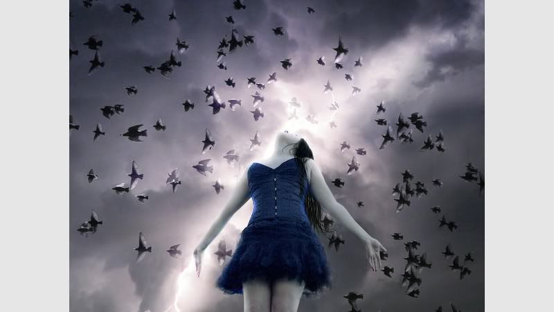
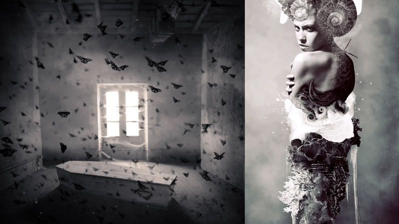
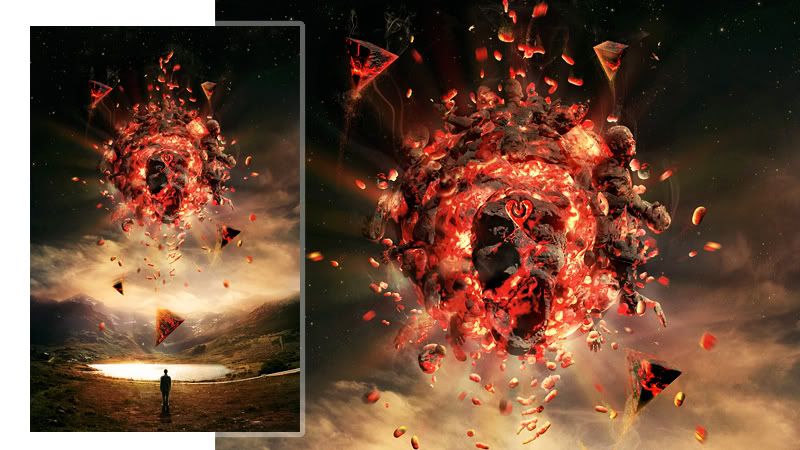

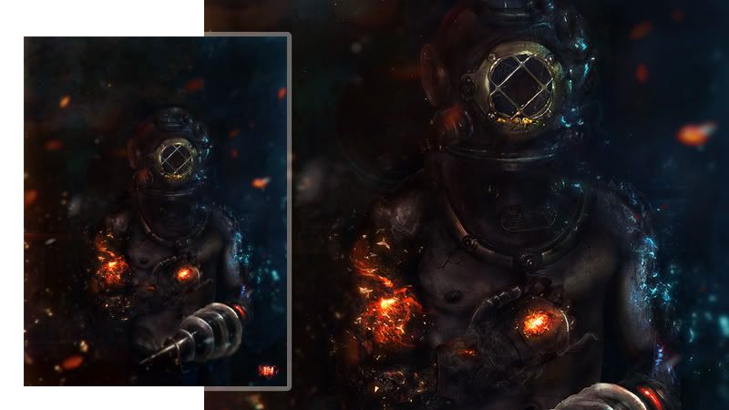
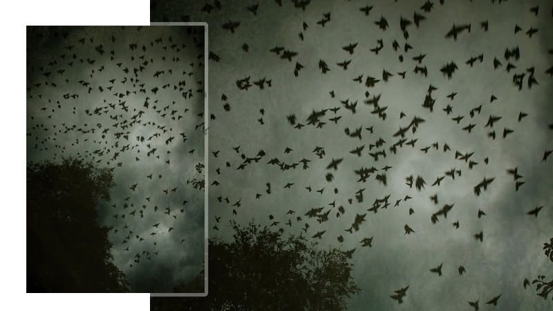
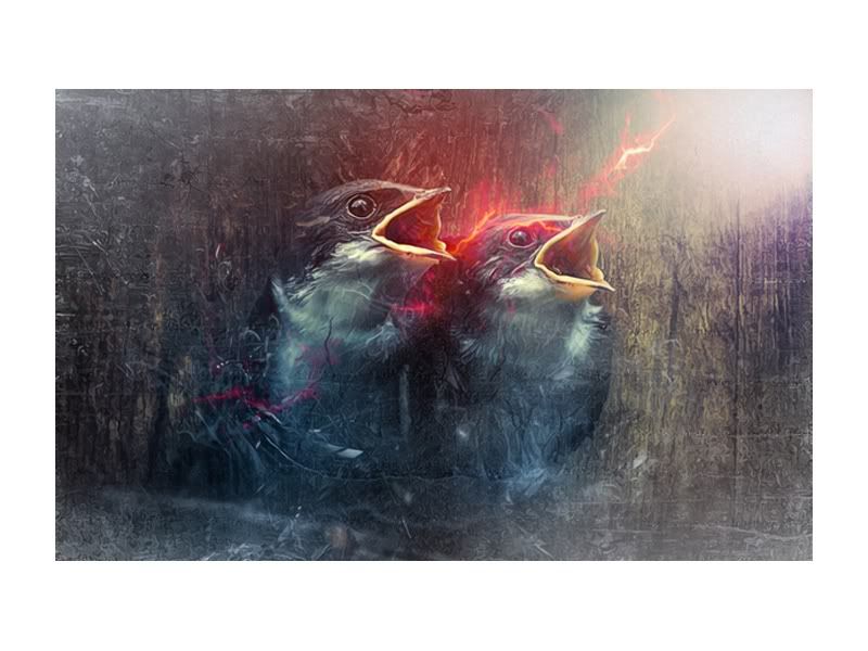
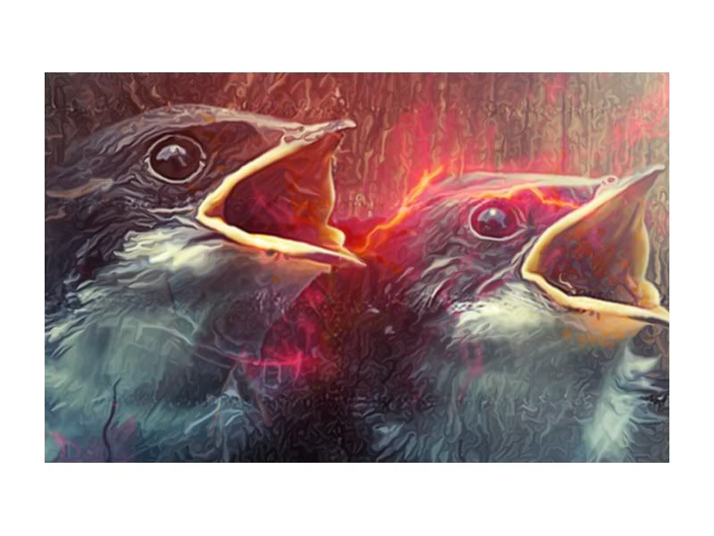
Also took some time to get some ideas about the actual conept itself of being free and the emotions behind it. This is where the idea of the birds taking flight came from. A lot of people see this feeling as the idea of freedom and it could work really well as a symbolic piece on an album cover. It should act as an obvious reference to the album title to most if it's included.
http://www.behance.net/gallery/Heartsurge-Exhibit-D-Awakening/1733253?utm_source=network&utm_medium=project_footer&utm_campaign=project_footer_references
Definitions of Key Words
1. To break loose from confinement; get free: escape from jail.
2. To issue from confinement or an enclosure; leak or seep out: Gas was escaping from the vent.
3. To avoid a serious or unwanted outcome: escaped from the accident with their lives.
4. Botany to become established in the wild. Used of a cultivated species.
5. Computer Science To interrupt a command, exit a program, or change levels within a program by using a key, combination of keys, or key sequence.
1. To succeed in avoiding: The thief escaped punishment.
2. To break loose from; get free of: The spacecraft escaped Earth's gravitational field.
3. To elude the memory or comprehension of: Her name escapes me. The book's significance escaped him.
4. To issue involuntarily from: A sigh escaped my lips.
1. The act or an instance of escaping.
2. A means of escaping.
3. A means of obtaining temporary freedom from worry, care, or unpleasantness: Television is my escape from worry.
4. A gradual effusion from an enclosure; a leakage.
5. Botany A plant that has become established away from the area of cultivation.
6. Computer Science A key, combination of keys, or key sequence, used especially to interrupt a command, exit a program, or change levels within a program.
Key words that are coming out:
Confinement, incarceration, imprisonment, internment, captivity, freedom, an enclosure. Provoking words for imagery.
Album Title - Slight Change in the Brief
Today I've been going through discussions with colleauges and also friends that are heavily into the subject matter. I've gone though all the information I've collated about the band and I've decided on an appropraite title that will just allow me to start designing for now. The title is picking up on some of the lyrics found in previous songs and the themes that they portrayed.
So the title for this is going to 'Heart Of A Coward' - 'Escape These walls'
The good thing with this title is that the term itself opens up to a focussed outcome but with lots of possible approaches. I'll start by unpicking the title to gain a greater focus on what I need to do.
Dmax Logo


Here is an image of the current DMAX logo. The logo itself carries an almost forced modern look. This type of font with filled in counters is pretty typical of a style we can look at say 'thats modern'. Although for me I don't really think this is the case. With a modern based font you could say that this ticks the first box in communicating to a modern audience.
For me though, the font itself just far to harsh in terms of edges etc. The weight also feels a little too heavy like it's just been drawn over a regular font rather than been designed to be that way and the 'M' and the 'X' just don't sit right.
The 3D aspect of this also feels a little weak. The colour isn't exactly jumping out and the composition and the design as a whole just feels rushed thrown together within the hour.

A quick investigation shows the possibility that this logo is based over Arial Black. I've nothing against a font that's bold and striking but for me, this just isnt working and I'll hopefully be able to understand why a little better throughout my research.
DMAX Logo

Here is an image of the current DMAX logo. The logo itself carries an almost forced modern look. This type of font with filled in counters is pretty typical of a style we can look at say 'thats modern'. Although for me I don't really think this is the case. With a modern based font you could say that this ticks the first box in communicating to a modern audience.
Saturday, 12 November 2011
HMV Primary Visit
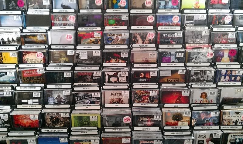
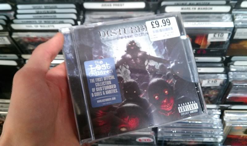
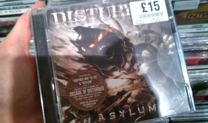

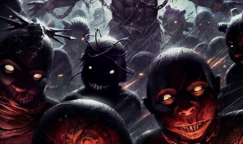

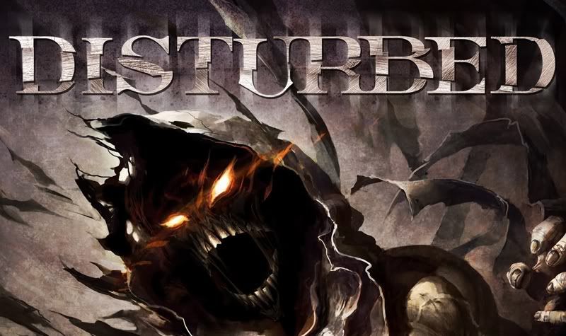
Things I never really took much thought into was the CD as a package and what you could do with the packaging. In these examples we have a little box with a lid to hold three CD's. In the other example of this pink special edition format there's a panel cut into the material revealing the orgion CD art beneath.
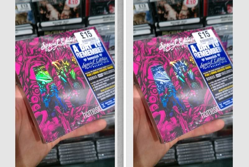
The case also had a reflective material, changing colours in different light.
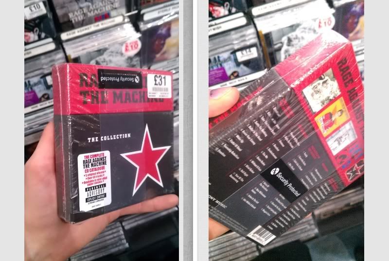
Friday, 11 November 2011
More about the Art of Tattooing Itself
Tattooing has been a Eurasian practice at least since around Neolithic times. Ötzi the Iceman, dating from the fourth to fifth millennium BC, was found in the Ötz valley in the Alps and had approximately 57 carbon tattoos consisting of simple dots and lines on his lower spine, behind his left knee, and on his right ankle. These tattoos were thought to be a form of healing because of their placement which resembles acupuncture.Other mummies bearing tattoos and dating from the end of the second millennium BC have been discovered, such as the Mummy of Amunet from ancient Egypt and the mummies at Pazyryk on the Ukok Plateau.
Pre-Christian Germanic, Celtic and other central and northern European tribes were often heavily tattooed, according to surviving accounts. The Picts were famously tattooed (or scarified) with elaborate dark blue woad (or possibly copper for the blue tone) designs. Julius Caesar described these tattoos in Book V of his Gallic Wars (54 BC).
Tattooing in Japan is thought to go back to the Paleolithic era, some ten thousand years ago.[citation needed] Various other cultures have had their own tattoo traditions, ranging from rubbing cuts and other wounds with ashes, to hand-pricking the skin to insert dyes.
Tattooing in the Western world today has its origins in Polynesia, and in the discovery of tatau by eighteenth century explorers. The Polynesian practice became popular among European sailors, before spreading to Western societies generally.
Growth in popularity
Tattoos have experienced a resurgence in popularity in many parts of the world, particularly in North and South America, Japan, and Europe. The growth in tattoo culture has seen an influx of new artists into the industry, many of whom have technical and fine arts training. Coupled with advancements in tattoo pigments and the ongoing refinement of the equipment used for tattooing, this has led to an improvement in the quality of tattoos being produced.
During the first decade of the 21st century, the presence of tattoos became evident within pop culture, inspiring television shows such as A&E's Inked and TLC's Miami Ink and LA Ink. The decoration of blues singer Janis Joplin with a wristlet and a small heart on her left breast, by the San Francisco tattoo artist Lyle Tuttle, has been called a seminal moment in the popular acceptance of tattoos as art. Formal interest in the art of the tattoo became prominent in the 1990s through the beginning of the 21st century. Contemporary art exhibitions and visual art institutions have featured tattoos as art through such means as displaying tattoo flash, examining the works of tattoo artists, or otherwise incorporating examples of body art into mainstream exhibits. One such 2009 Chicago exhibition Freaks & Flash featured both examples of historic body art as well as the tattoo artists who produced it.
Tattooing has become a fad among celebrities. David Beckham, an international soccer star, caught tattoo ‘fever’ beginning with the birth of his first son back in 1999 when he had Malloy ink his son’s name, “Brooklyn” at the bottom of his back. Then he had the first part of his guardian angel inked on his back. This was followed up in 2000, with his wife’s name being misspelled in Hindi on his left arm/
Many studies have been done of the tattooed population and society's view of tattoos. In June 2006 the Journal of the American Academy of Dermatology published the results of a telephone survey which took place in 2004. It found that 36% of Americans ages 18–29, 24% of those 30-40 and 15% of those 41-51 had a tattoo.
In September 2006, the Pew Research Center conducted a telephone survey which found that 36% of Americans ages 18–25, 40% of those 26-40 and 10% of those 41-64 had a tattoo.[18] In January 2008, a survey conducted online by Harris Interactive estimated that 14% of all adults in the United States have a tattoo, just slightly down from 2003, when 16% had a tattoo. Among age groups, 9% of those ages 18–24, 32% of those 25-29, 25% of those 30-39 and 12% of those 40-49 have tattoos, as do 8% of those 50-64. Men are just slightly more likely to have a tattoo than women (15% versus 13%)
Negative associations
In Japan, tattoos are strongly associated with organized crime organizations known as the yakuza, particularly full body tattoos done the traditional Japanese way (Tebori). Many public Japanese bathhouses (sentō) and gymnasiums often openly ban those bearing large or graphic tattoos in an attempt to prevent Yakuza from entering. The Government of Meiji Japan had outlawed tattoos in the 19th century, a prohibition that stood for 70 years before being repealed in 1948.
In the United States many prisoners and criminal gangs use distinctive tattoos to indicate facts about their criminal behavior, prison sentences, and organizational affiliation. A tear tattoo, for example, can be symbolic of murder, with each tear representing the death of a friend. At the same time, members of the U.S. military have an equally well established and longstanding history of tattooing to indicate military units, battles, kills, etc., an association which remains widespread among older Americans. Tattooing is also common in the British Armed Forces.
Tattooing was also used by the Nazi regime in Nazi concentration camps to tag prisoners.
Insofar as this cultural or subcultural use of tattoos predates the widespread popularity of tattoos in the general population, tattoos are still associated with criminality. Tatoos on the face in the shape of teardrops are usually associated with how many people a person has murdered. Although the general acceptance of tattoos is on the rise in Western society, they still carry a heavy stigma among certain social groups. Tattoos are generally considered an important part of the culture of the Russian mafia.
The prevalence of women in the tattoo industry, along with larger numbers of women bearing tattoos, appears to be changing negative perceptions. A study of "at-risk" (as defined by school absenteeism and truancy) adolescent girls showed a positive correlation between body-modification and negative feelings towards the body and self-esteem; however, also illustrating a strong motive for body-modification as the search for "self and attempts to attain mastery and control over the body in an age of increasing alienation."
List of Current Shows
Target Audience
DMAX, +1 and +2
Genre: Entertainment
EPG Location: 144, 145 and 155
In A Nutshell
DMAX is the channel where men are entertained by enjoyable, engaging, straight-up shows. It's the channel where characters lead the programmes, whether they're expert mechanics, adventurers, tattoo artists or just all round impressive guys.
Defining Programmes
Miami Ink - LA Ink - Airwolf - NYPD Blue - London's Burning - Lisa Williams - Mythbusters - My Shocking Story - Monkey Business.
Audience
DMAX attracts a slightly more female audience - 54%
DMAX is popular amongst 16-34's
DMAX has a monthly reach of 3.5m individuals
SkyView Insights
DMAX viewers are more likely to...
Be owners of technology inlcuding a PC, Apple Mac, XBox or Sony Playstation
Enjoy a bit of DIY
Like listening to music
Like to keep fit / go to the gym
http://www.skymedia.co.uk/Channels/entertainment/dmax.aspx
DMAX
DMAX is a TV channel in the UK and Ireland. Discovery announced on 22 November 2007, that they would launch a version of DMAX in the UK and Ireland market on 8 January 2008 after its initial success in Germany.
In addition, the timeshift service DMAX +1 has also been available on Sky since the launch. A two hour timeshift channel named DMAX +2 launched on Sky on 1 April 2008.
Minimalist Work
Link to Blog Post
"When we went to the supermarket in our last trip to London, we've noticed that, "Our packaging project could go to next level". This second edition has one more variation and now, we are showing all brand names with simple text & same font, without logo or corporate sign on it. The font is Helvetica Neu Bold. Our question is similar with the question in our first post!
What is your choice in these 4 different variations?
1. Original variation
2. Simple variation
3. More simple variation
4. No logo variation
External Source:
High Resolution Images
Why Simple Is Good: Jonathan Ive"
Iron Fist - Clothing Brand - Image Research
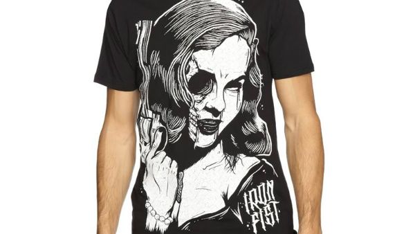
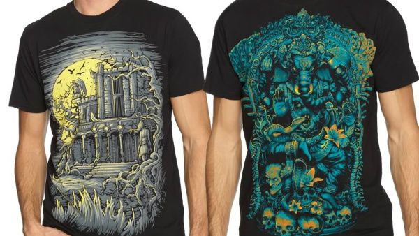
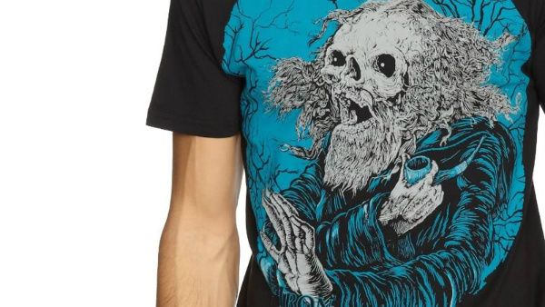
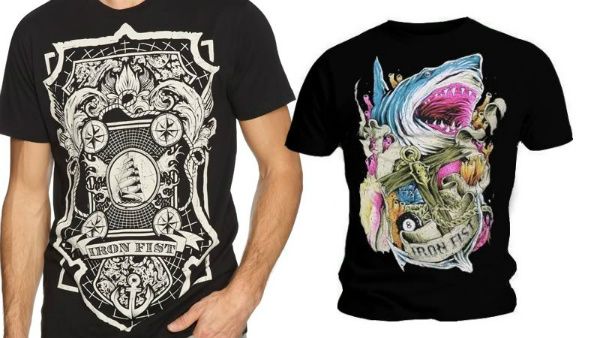
Liking this image, same kind of style to the wood/lino cuts I was looking at. Real old school design. Not enough to work alone on a album cover is this style however. Would need to be worked in with some more similar styles to make a more rounded piece of album art.
Where does it all Exist then?
Stores
HMV
Online
Amazon
Play
Apple
Spotify
Napster
Music Corner
Musicstore
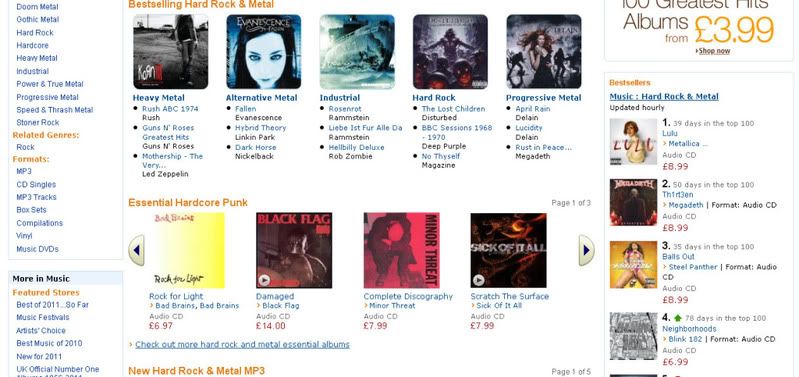
Like I said, just a few of the largest, more well known retailers. The online stuff is probably a bit useless to be honest. I've included some screens below and as you can see it's not interesting. The albums are listed in TOP SELLER format.
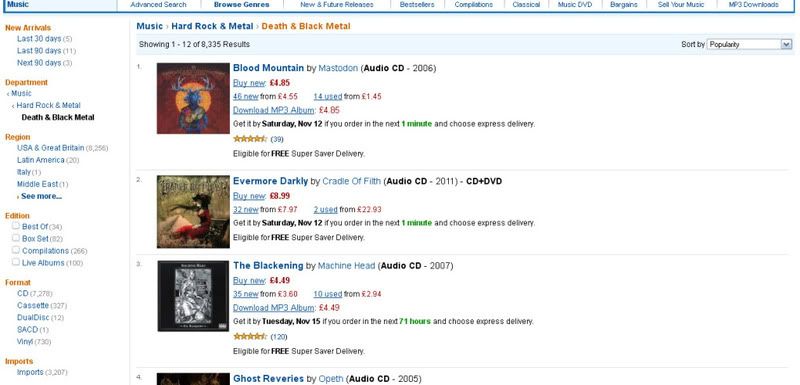
What I NEED to do is go into the stores and look at/photograph the albums in context. From doing this I'll be able to see which covers stand out from the crowd and what grabs my eyes as a viewer. If I can come across some albums that make me want to pick them up, then that is what I need to be analysing more closly.
Jeff Finley - Beauty is a Black Hole
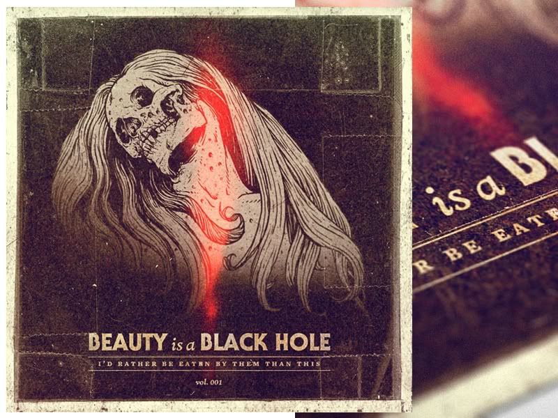
Video Tutorial Sample. Shame it's just a sample because you have to buy the full version but it still looks at some neet ways of compositing the scene.


