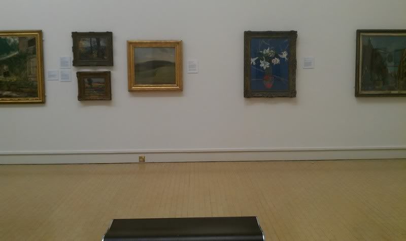
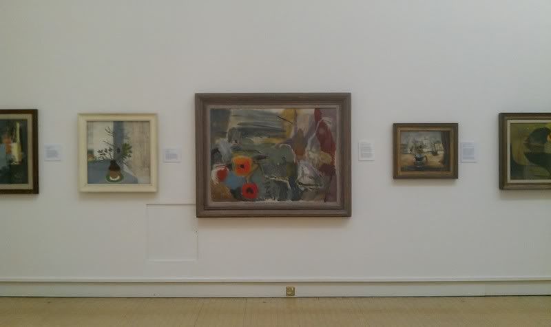
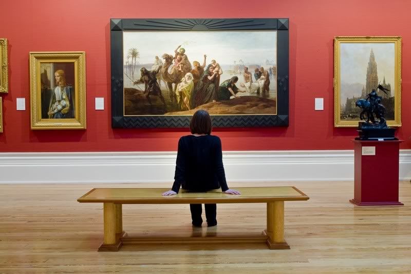
Just want to talk a little about the image above. I really found this wall appealing in terms of it's layout. I want my main image to be the focus but I still want it work with the gallery style by including other pictures. The layout of having the main image in a large frame and too smaller ones appears to work really well. If I applied this to my design work I should be able to get a clearer hierarchy in focus points.
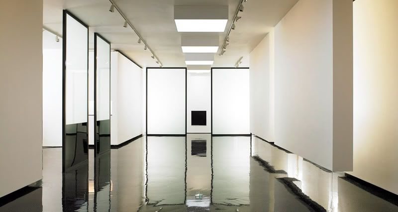
Images from various places on the net:

No comments:
Post a Comment