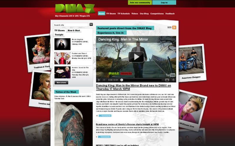
So the site itself is pretty boring. We've got the terrible 3d logo up top. I mean, if we had to just talk about the logo itself I think we'd be here for quite some time. The composition of the whole logo as a whole is just bizare. The rotation of the D is kind of explainable'. I mean, I can see the idea of maybe wanting to seperate the D and using the word MAX but this didn't happen. We've got D...MA and the X? Why is the X pushed so much forward on Z axis. Is to say "Hey you! yeh look over here, I'm 3D'. What was the thinking behind this, I'll never know but for me it just doesnt work.
The colour scheme red and green is a little bit ready steady cook or even just a bit festive for my liking. And the polaroids running down the sides don't reflect anything about the programming and it just feels a little 90's photoshop in how their framed.

No comments:
Post a Comment