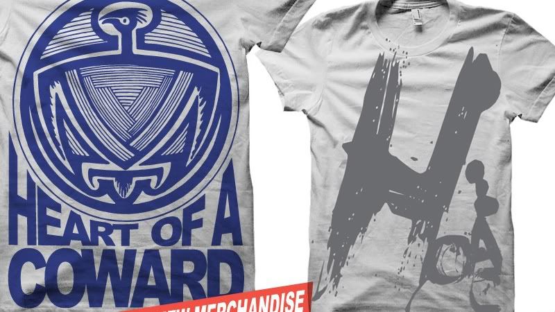
It's not that I don't like the design but what get's me most with the entire range is the lack of context. I mean, what is this pattern, how is it relevant to the music? Maybe its just me and these wiered shapes do share something with the music but I kinda see that to be unlikely.
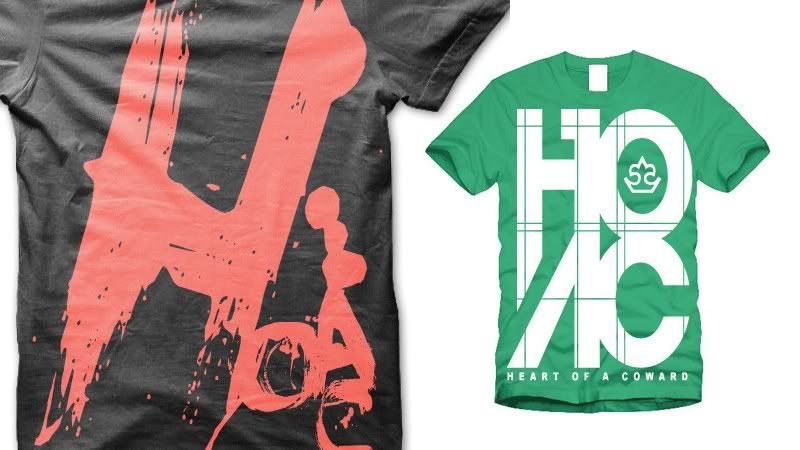
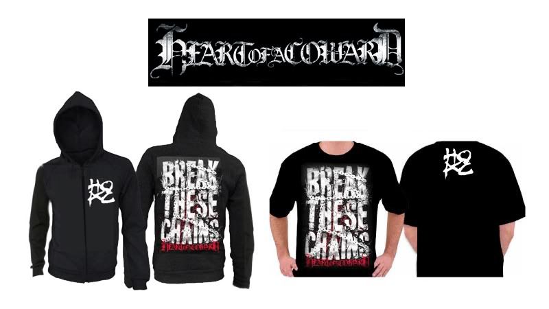
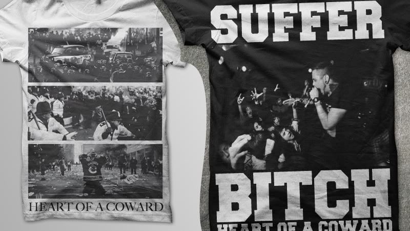
The riots shirt has to be the shirt that stands out the most. What is this all about? It seems that it's almost a standardised product with the bands name sneakily added beneath the image. I dont really know which riot this is, the recent ones? Still irrelevant to anything and confuses the hell out of me. Never the less, I have no doubt this is currently selling regardless.
Put this piece of work together below. Essential bit of research here as it's going to let me see what kind of work is being produced by other bands of the same/similar genre. This will then go towards informing my own studies of what currently exists and the style of art being produced. Most of the shirts are print screens taken from www.impericon.com/uk
Favourite Styles taken from research above;
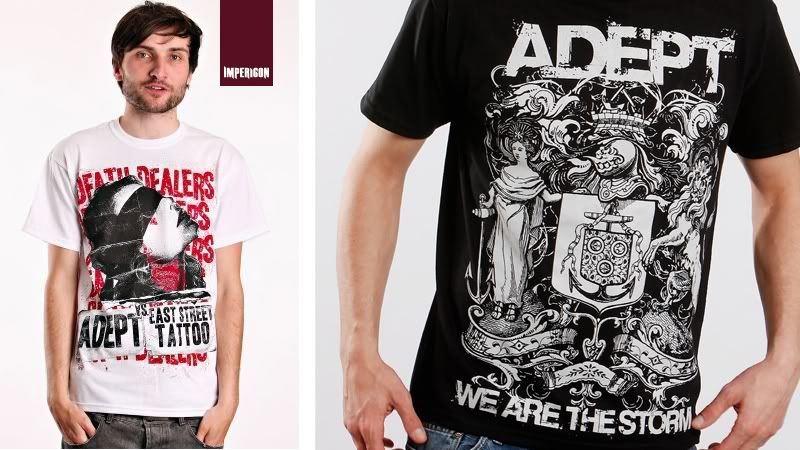
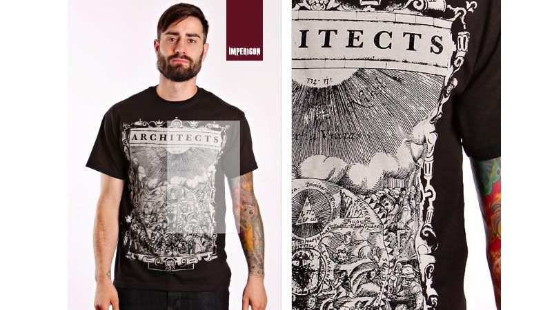
With these two I really love the simpe colour pallete of white on black and just the nice use of detailing that's been applied to the illustration. I think when you've got something that's simple in colour and really well produced in style it reflects on the image of the band a lot better than say having a shit that looks like a mess; because that could almost suggest that the bands a mess. Just in the way that you kind of see a shirt as a walking advertisment for your product and if it's giving off a bad image it can directly affect the image of the product, in this case the band.
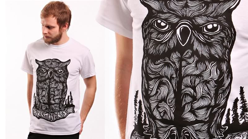
Got to say this is by far the best merchandise based T-shirt I came across on the web and I've been through hundreds of shirts to get this list. What I really love is the sense of flow how it looks like a wood block carving I used to do back at school. The style is almost tattoo themed as well. The problem with this is that theres an owl on an architects shirt but I'm going to have to look past that for now and just concentrate on the style. I'm going to try and get hold of some more examples similar to this because it's really jumping out to me right now. Maybe wood carvings might be the place to start?
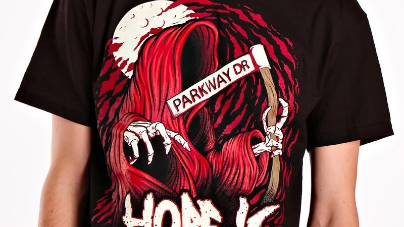
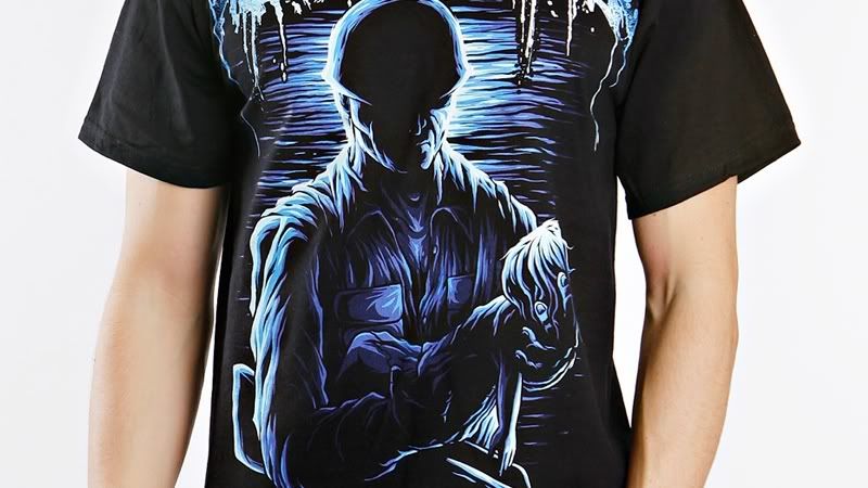
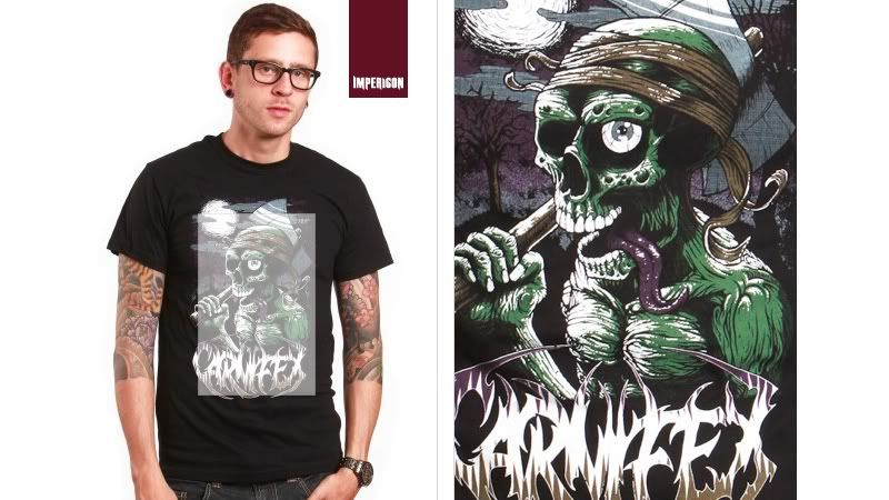
Similar to what was said above but with colour. Obviously a photoshop paint, hundred percent opacities with shape dynamics. I've tried a style of painting like this before an what I've found is that the main sucess works on the quality and simplicity of the colour palete. More colour you use it starts to look like a paint by numbers but this image really pulls it off. As said above, some tutorials and other examples should fuel some concepts with this.
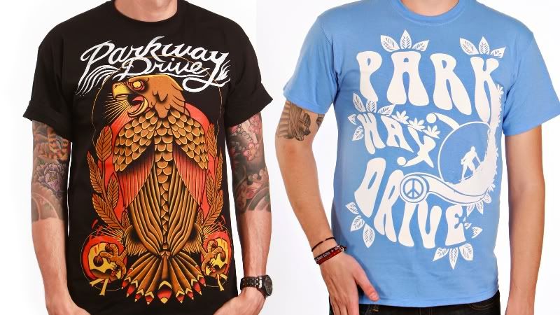
This is something I really like. I actually know of a tattoo artist, Gre Hale. The work itself just feels well composited with some really nice colour decisions and blending. The image as a whole I think works really nice and is strong at grabbing a viewers attention.
http://www.facebook.com/graemehale
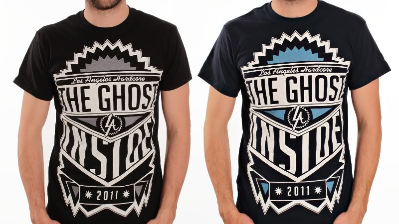
Completely different style, reminds me Robyn Makinson's work which I've always liked. I think it's the use of type that appeals to me in this example though. Just the way everythings being shaped to work as an almost badge shape format.

No comments:
Post a Comment