What I've found most useful from this is the Toy Story poster (the one with the pink bear.. always forget his name) because it uses multiple characters in a really well laid out way. Also most of the characters are dead on in scale and not to one side for example; which is good because most of my sketches are all in this same perspective. I'm going to try and pretty much use this poster as a base to try and get working with my layout and start to experiment ways in which I can use my 3D layering effect discussed previously.
Tuesday, 18 October 2011
Poster Compilations
Just wanted to look at how other posters work when combining numerous characters onto one page. Hopefully it will help me identify ways in which I can lay out my characters without it looking tacky.
What I've found most useful from this is the Toy Story poster (the one with the pink bear.. always forget his name) because it uses multiple characters in a really well laid out way. Also most of the characters are dead on in scale and not to one side for example; which is good because most of my sketches are all in this same perspective. I'm going to try and pretty much use this poster as a base to try and get working with my layout and start to experiment ways in which I can use my 3D layering effect discussed previously.
What I've found most useful from this is the Toy Story poster (the one with the pink bear.. always forget his name) because it uses multiple characters in a really well laid out way. Also most of the characters are dead on in scale and not to one side for example; which is good because most of my sketches are all in this same perspective. I'm going to try and pretty much use this poster as a base to try and get working with my layout and start to experiment ways in which I can use my 3D layering effect discussed previously.
Monday, 17 October 2011
Product Research - Catalogs
Alongside looking at the products around me and on the net, I've been recently drawing ideas over product shot from Argos' catalog and also putting ideas to paper to test some ideas.
I've definitly found this a really useful reference and it's helping me get more focus to the range I'll include with my charactere.
I've definitly found this a really useful reference and it's helping me get more focus to the range I'll include with my charactere.
Saturday, 15 October 2011
Illustration Research - Books
Just to help me out and help work alongside the examples of work I have going on with drawing from other peoples work; I took a look at this book "The art of drawing". The book itself is one of those introductions to the theory of drawing etc but it had some pretty useful tips I've looked at in the past and it was a nice refresher to get some ideas going.
Friday, 14 October 2011
Argos
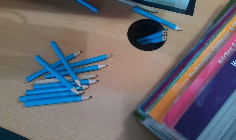
Something to consider, could create a small stationary range such as pens and pencils.
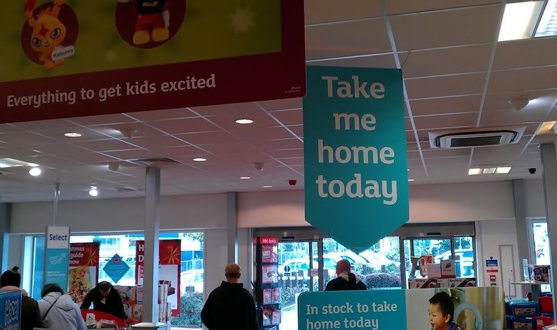
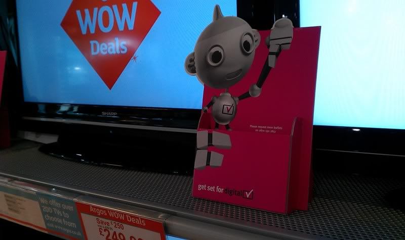
Quite like these handout carriers. Could use these as a way of houlding the offers leaflets.
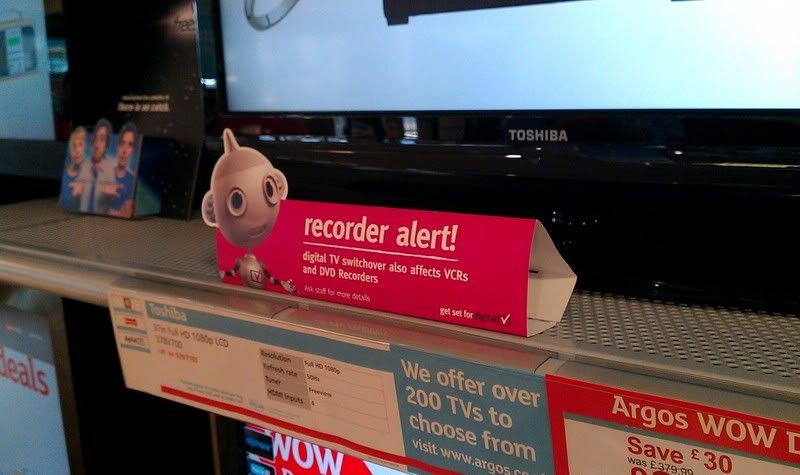
Another thing I like to pop on the ends of the shelving.
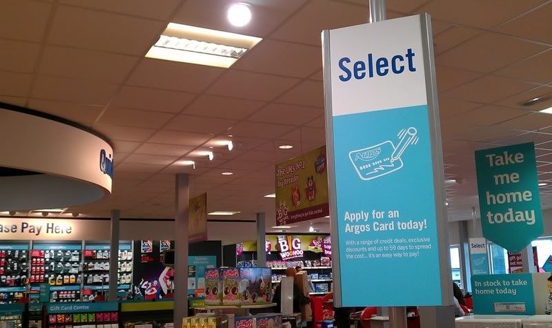
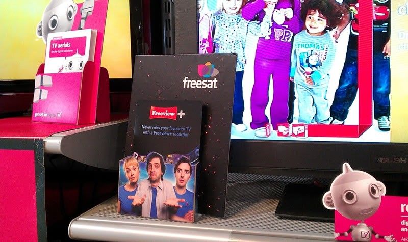
I like this but I'm not keen on the fact that the top of the POS just has harsh edges. Much prefering the curved cutouts we've seen in other areas.
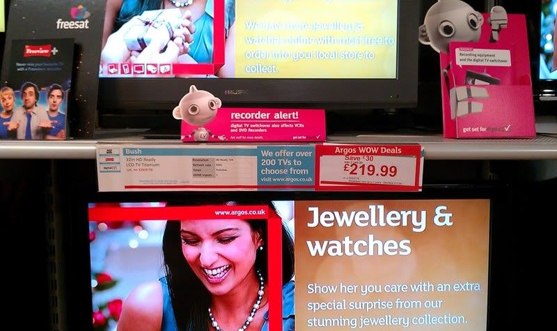
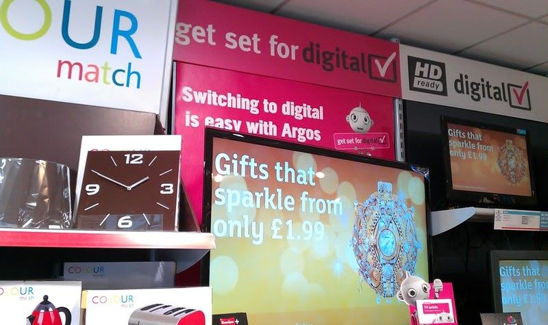
Thursday, 13 October 2011
Main Point of Catergorie Ref
Main Point of Reference is going to be the contents page from the Argos Catalog. I posted all the links to pages before but it took up pages on my blogger so to simplify things, here the link
CLICK HERE
CLICK HERE
In Depth Catergories Research
Since my tutorial with Lorenzo I know that to understand and inform my design work I need to develop the understanding of my categories. This basically means for a category like outdoor furniture maybe I need to know everything about the outdoors and garden scene's, plants etc.
Outdoor Furniture
Garden Decoration
Garden furniture
Garden power tools
Garden tools and accessories
Hot tubs and spas
Lawnmowers
Outdoor lighting and heating
Pressure washers
Sheds, greenhouses and storage
Arbours
Garden benches
Garden chairs and loungers
Garden furniture covers
Garden furniture cushions
Garden parasols
Garden table and chair sets
Gazebos and garden awnings
Hammocks
At this point I think I'll stop researching the catergories in this way. Mostly because it's taken 2 hours to find these sections and gain secondary photographs of them. But more importantly.. these categories are all inside something as simple as the Argos catalog so rather than using great chunks of time now, I'll go in and select pieces of information as and when I need it, documenting along the way.
Primary Resarch - In Stores Toy's 'R' Us
Toy's 'R' Us
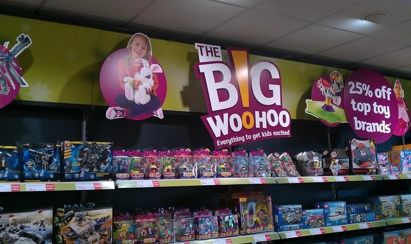
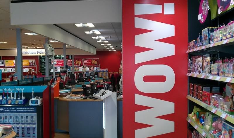
It seems a little off topic photographing a toy store for evidence but I'm getting so caught up in the idea of having things slightly raised off walls to get that nice shadowing 3D effect and I wanted to see what was happening here. I was hoping to see lots of bright interesting forms of signage and advertisement withing the store and I wasn't disappointed.
I previously blogged some images of the Disney Pixar's 'Cars' stand which really appealed to me but in this visit I tried to capture as much as I could.
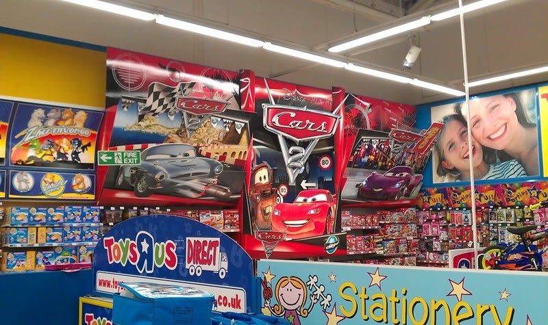
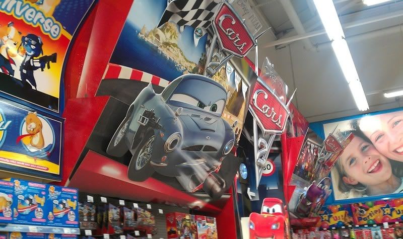
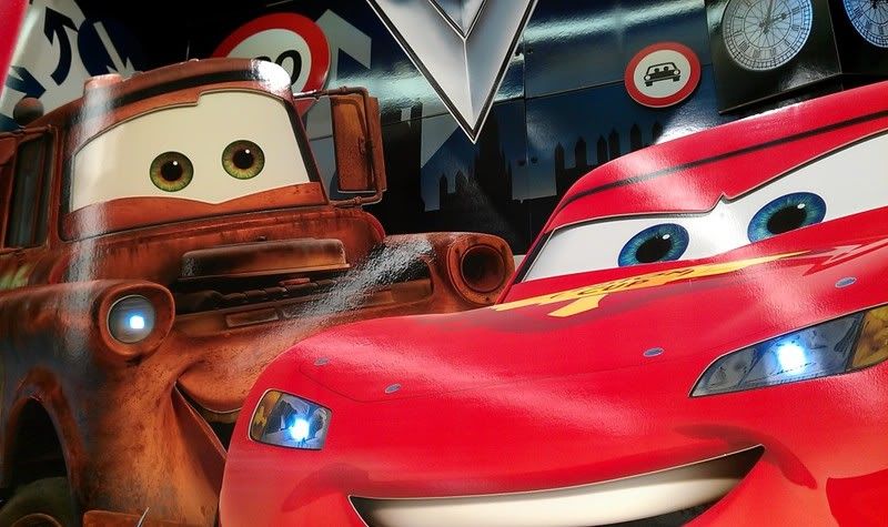

It really is hard to transpire on photograph how huge this is but just look at the size of the toys compared to this. It's massive and looks great. Not going to talk about it again because I've done that in a previous post but what I didn't pick up on before was the plastic sheet with Disney Pixar printed onto it. So where not just working with cards now. Effective because of the lighting shining around the POS, helps give this feature a nice glossy finish.
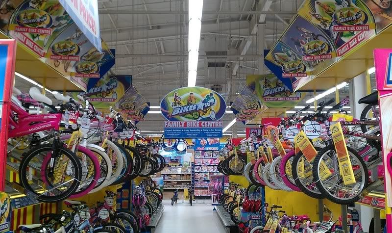
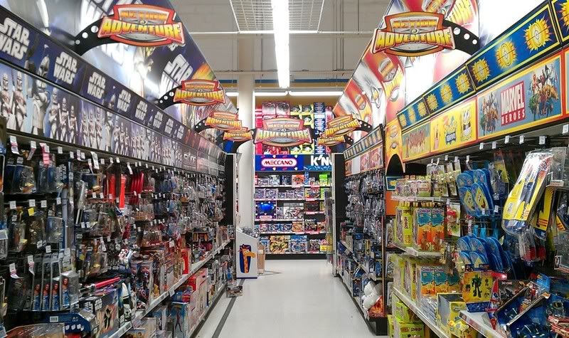
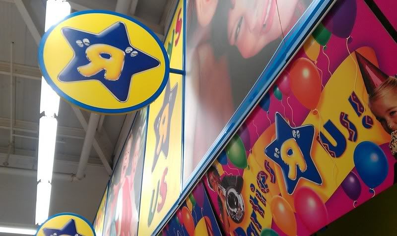
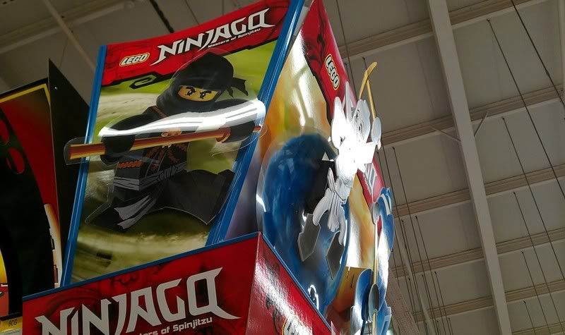
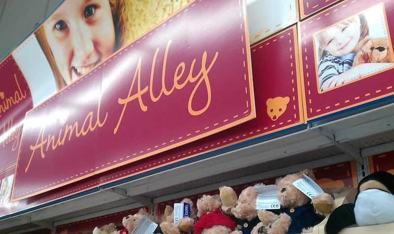
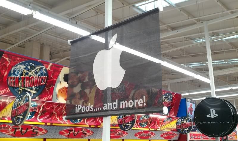
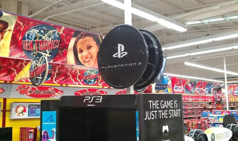
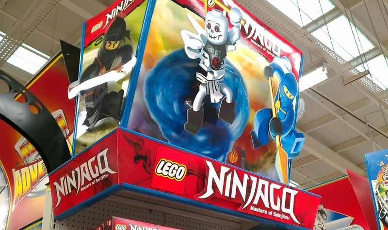
I don't want this post to make my research look like it's in any way getting confused. I know I'm working on household furnishing stores but what's true about this brief is that I'm also heavily touching on signage, and Toys R Us offers a wide range of material for me to look at and pretty much get inspiration from. Always enjoy looking around these kinda places in general as it brings back memories of Christmas and everything great that comes with that, but in all I got a good bit of research, just need to continue this, look around a few more places and continue with the design process!
It seems a little off topic photographing a toy store for evidence but I'm getting so caught up in the idea of having things slightly raised off walls to get that nice shadowing 3D effect and I wanted to see what was happening here. I was hoping to see lots of bright interesting forms of signage and advertisement withing the store and I wasn't disappointed.
I previously blogged some images of the Disney Pixar's 'Cars' stand which really appealed to me but in this visit I tried to capture as much as I could.


It really is hard to transpire on photograph how huge this is but just look at the size of the toys compared to this. It's massive and looks great. Not going to talk about it again because I've done that in a previous post but what I didn't pick up on before was the plastic sheet with Disney Pixar printed onto it. So where not just working with cards now. Effective because of the lighting shining around the POS, helps give this feature a nice glossy finish.


I don't want this post to make my research look like it's in any way getting confused. I know I'm working on household furnishing stores but what's true about this brief is that I'm also heavily touching on signage, and Toys R Us offers a wide range of material for me to look at and pretty much get inspiration from. Always enjoy looking around these kinda places in general as it brings back memories of Christmas and everything great that comes with that, but in all I got a good bit of research, just need to continue this, look around a few more places and continue with the design process!
Primary Resarch - In Stores - IKEA
IKEA
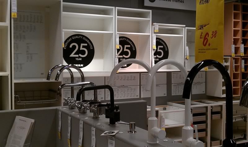
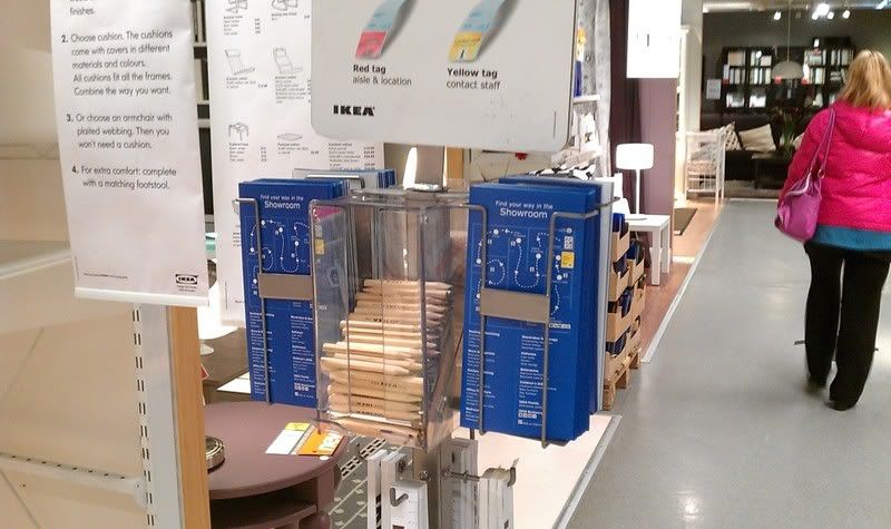
The other day I took a trip down to IKEA to check out what kind of work was being produced to dress their store. What I found was that the store has a heavy use of signage throughout. This can include bright attractive wall length signs to small little cut outs hanging from shelves and products. Anyway, I've taken some photo's so I don't have to tell the thousand words myself and I've written a small caption for some that interests me.
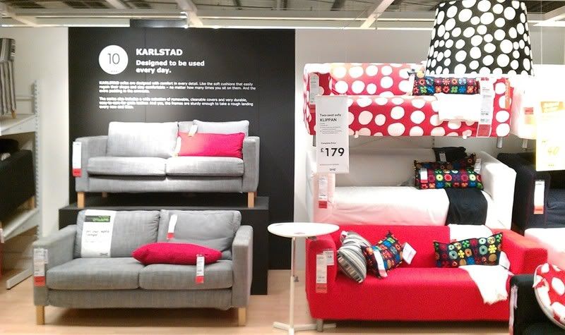
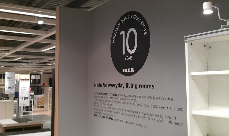
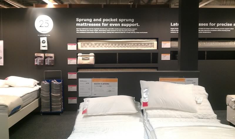
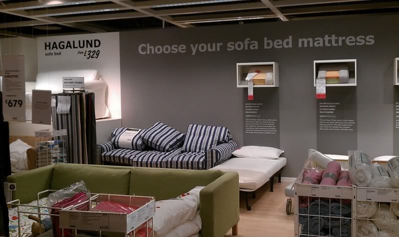
Vinyl cut text, nice and big on the wall. Can be seen at a great distance thanks to the type and just works more effectively as it's incorporated into the scene much better than using posters or extra signage.
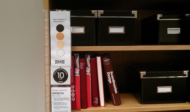
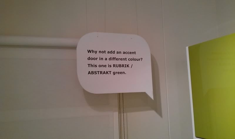
Really like this. Without even having a member of staff their, this little speech bubble adds tips to the customer in this clever little cut out.
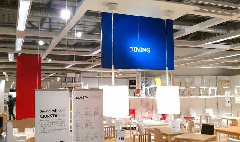
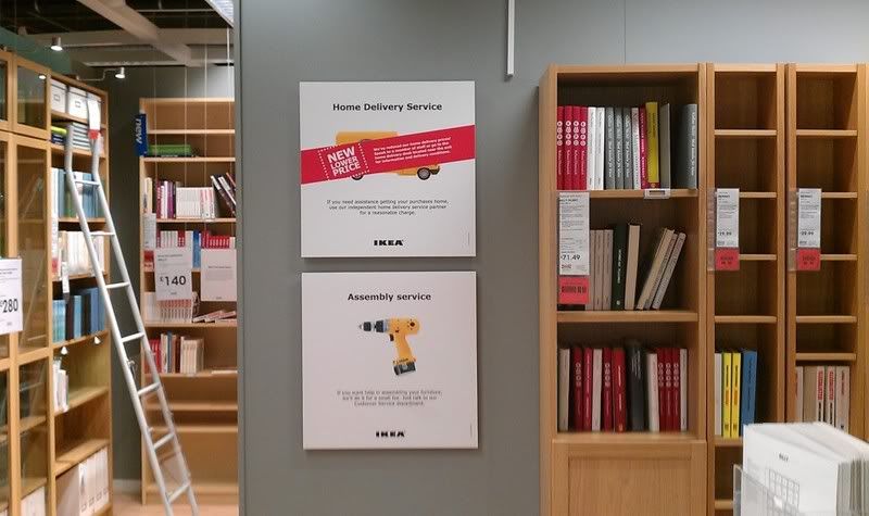
Theme of the signage that runs about each isle. A little boring but the colour is keyed to that of the sight map and I think this is the only real use of this shade of blue throughout so it's definitely distinctive.
 ]
]
http://s714.photobucket.com/albums/ww144/robinsrl01/IKEA/?action=view¤t=IMAG0630.jpg#!oZZ15QQcurrentZZhttp%3A%2F%2Fs714.photobucket.com%2Falbums%2Fww144%2Frobinsrl01%2FIKEA%2F%3Faction%3Dview%26current%3DIMAG0614.jpg
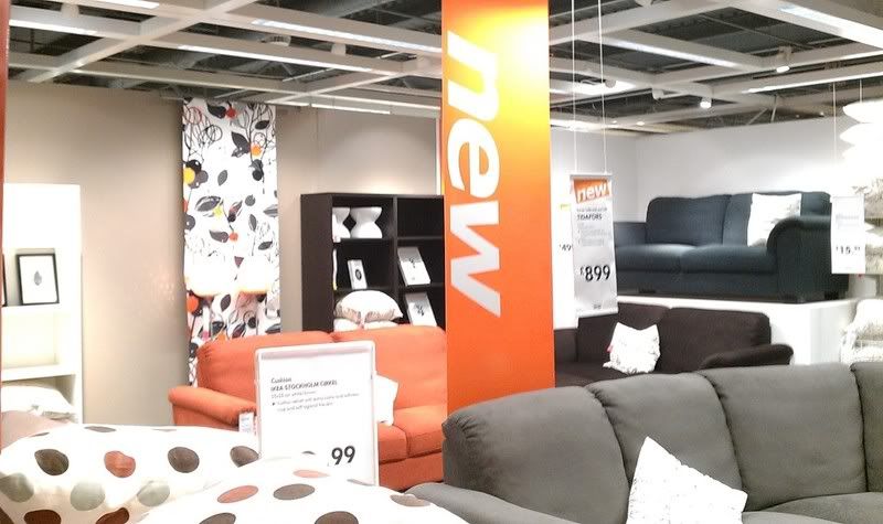
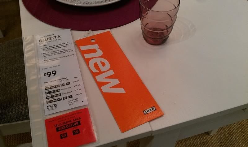
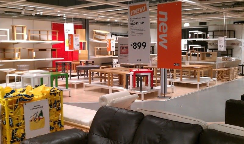
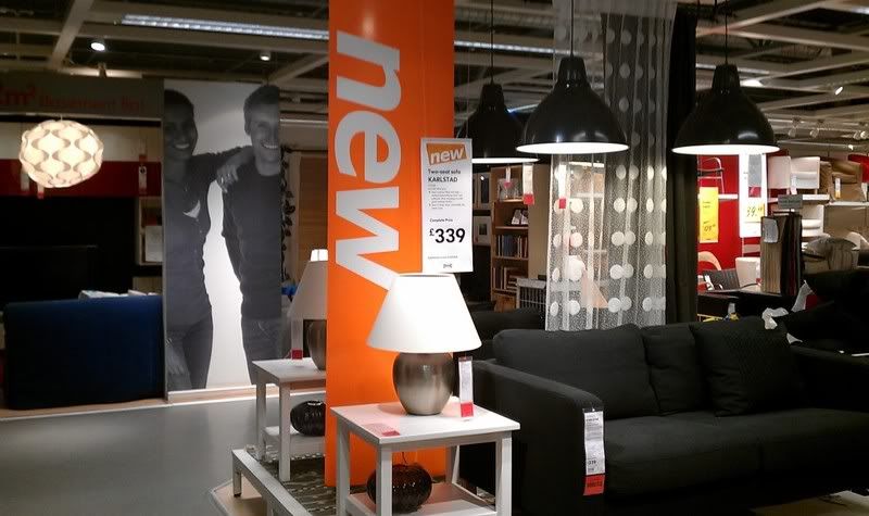
The large 'NEW' signs
What I think IKEA really achieves well in store is that everything's a done a little different. In my opinion, much better than others. I'm getting a little bored now of looking at A format posters and signage and it seem so is the store. Everything appears to be better thought out and much more workable and interactive to the store layout and products than just an A1 sheet plastered to a wall. The vinyl cuts and the little speech bubbles are something I'm going to take on board most from the visit. It's really simple and works great, possibly something to keep in mind.
What I'm mostly picking up on is my interest to experiment with raising off layers in my images and helping the design pop and look more modern rather than printing posters. Definitely more relevant to do this in store as you have the space.
The other day I took a trip down to IKEA to check out what kind of work was being produced to dress their store. What I found was that the store has a heavy use of signage throughout. This can include bright attractive wall length signs to small little cut outs hanging from shelves and products. Anyway, I've taken some photo's so I don't have to tell the thousand words myself and I've written a small caption for some that interests me.


Vinyl cut text, nice and big on the wall. Can be seen at a great distance thanks to the type and just works more effectively as it's incorporated into the scene much better than using posters or extra signage.


Really like this. Without even having a member of staff their, this little speech bubble adds tips to the customer in this clever little cut out.


Theme of the signage that runs about each isle. A little boring but the colour is keyed to that of the sight map and I think this is the only real use of this shade of blue throughout so it's definitely distinctive.

 ]
]


http://s714.photobucket.com/albums/ww144/robinsrl01/IKEA/?action=view¤t=IMAG0630.jpg#!oZZ15QQcurrentZZhttp%3A%2F%2Fs714.photobucket.com%2Falbums%2Fww144%2Frobinsrl01%2FIKEA%2F%3Faction%3Dview%26current%3DIMAG0614.jpg

The large 'NEW' signs
What I think IKEA really achieves well in store is that everything's a done a little different. In my opinion, much better than others. I'm getting a little bored now of looking at A format posters and signage and it seem so is the store. Everything appears to be better thought out and much more workable and interactive to the store layout and products than just an A1 sheet plastered to a wall. The vinyl cuts and the little speech bubbles are something I'm going to take on board most from the visit. It's really simple and works great, possibly something to keep in mind.
What I'm mostly picking up on is my interest to experiment with raising off layers in my images and helping the design pop and look more modern rather than printing posters. Definitely more relevant to do this in store as you have the space.
Subscribe to:
Comments (Atom)

